Trip Sky
Cannabis Company
Brand Identity + Art Direction
Building brand equity is an uphill battle for cannabis companies in Canada, facing strict regulations outlined in the Cannabis Act of 2018. Products and accessories must not depict cannabis imagery, or promote consumption. As well, brand collateral and imagery must comply with prohibitive glamour, lifestyle promotion, and youth-appeal rules.
The challenge for this creative branding project is to have it remain consistent, and effective, when deconstructed for domestic retail. I believe we came to a solution that meets all legal requirements.
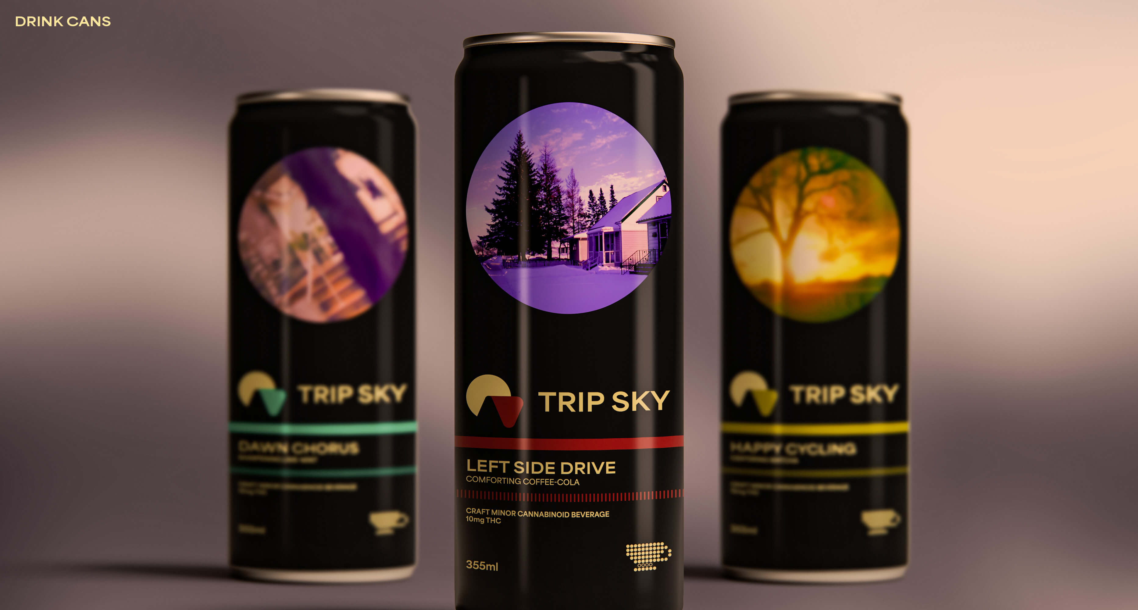
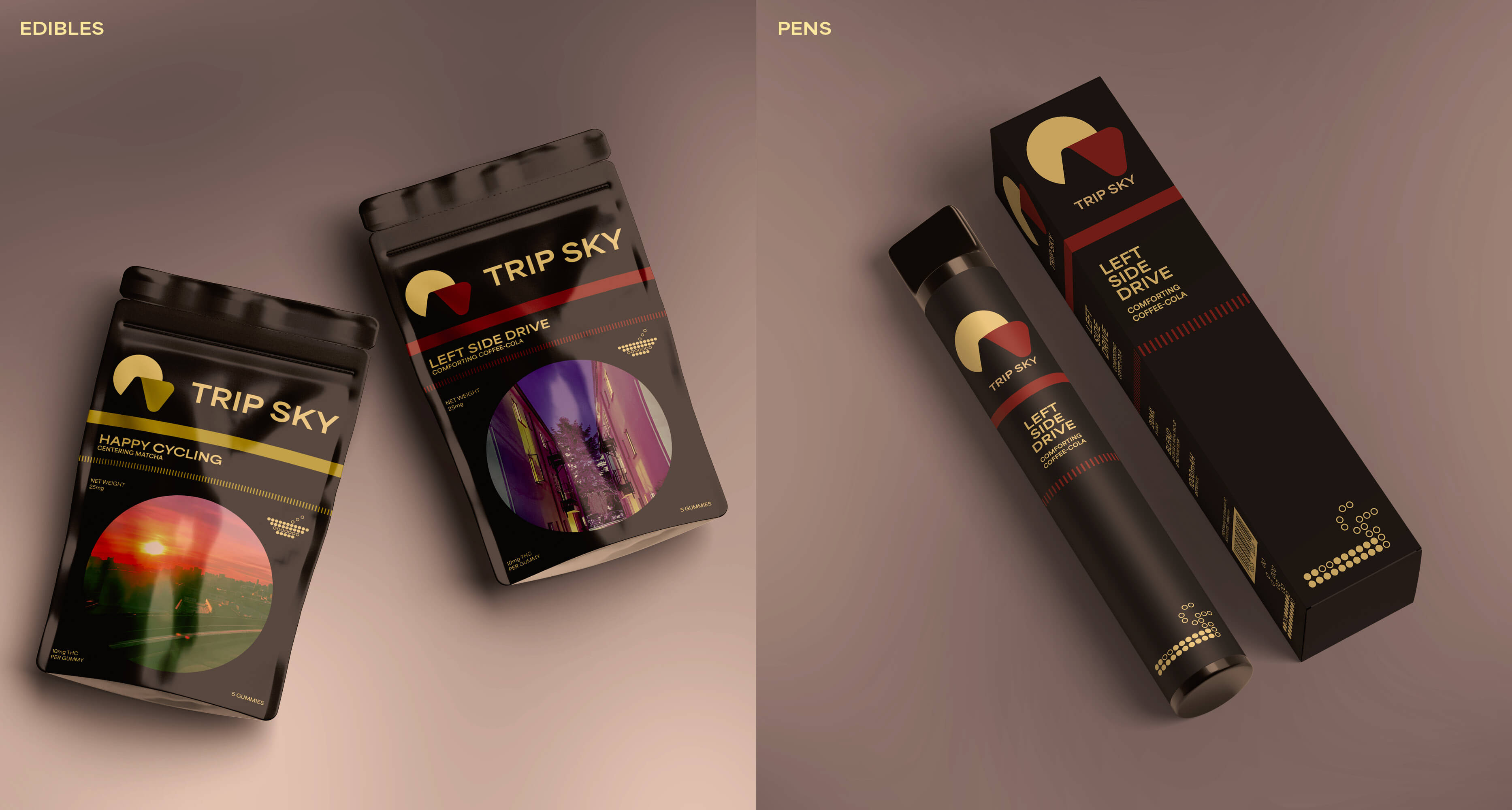
Their startup pitch was simple: Trip Sky is a local cannabis company, based in British Columbia. Their business model is to have three core flavours (Coffee-Cola, Lime Mint, and Matcha), and to generate long-term interest with limited-run flavours. They do not want to provide traditional cannabis plants, instead focusing on other modes of consumption: Drinks, Edibles, and Vape Pens.
Their branding pitch was also simple: unlike other cannabis companies that carry nostalgic or earthy aesthetics, they desired a more sophisticated direction. Contemplation and deep thought was the vibe they were going for, drawing influences from lofi music and liminal spaces.
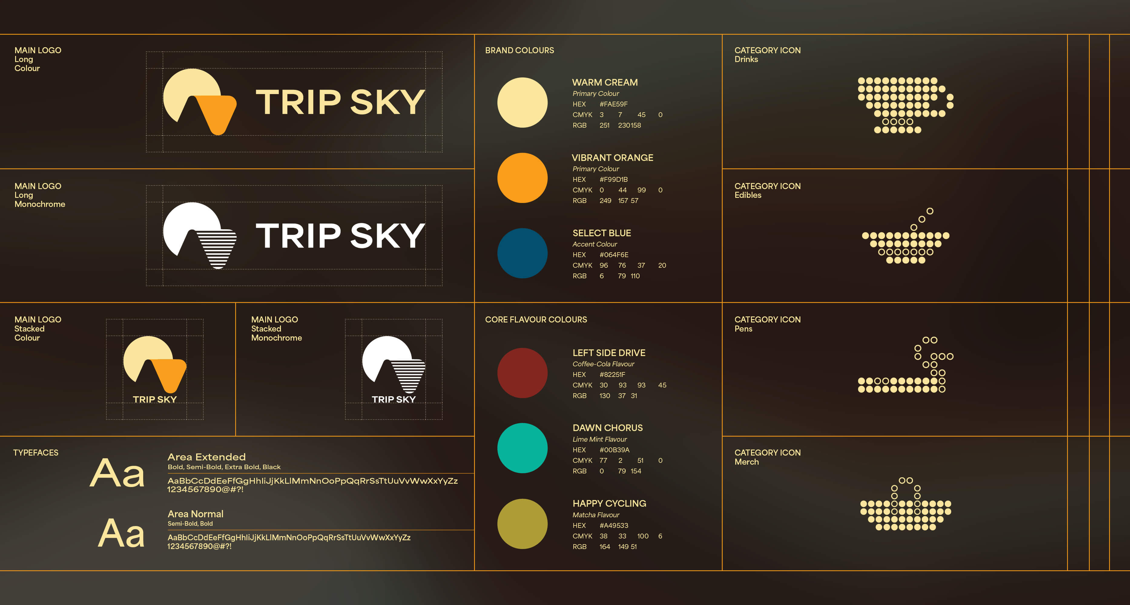
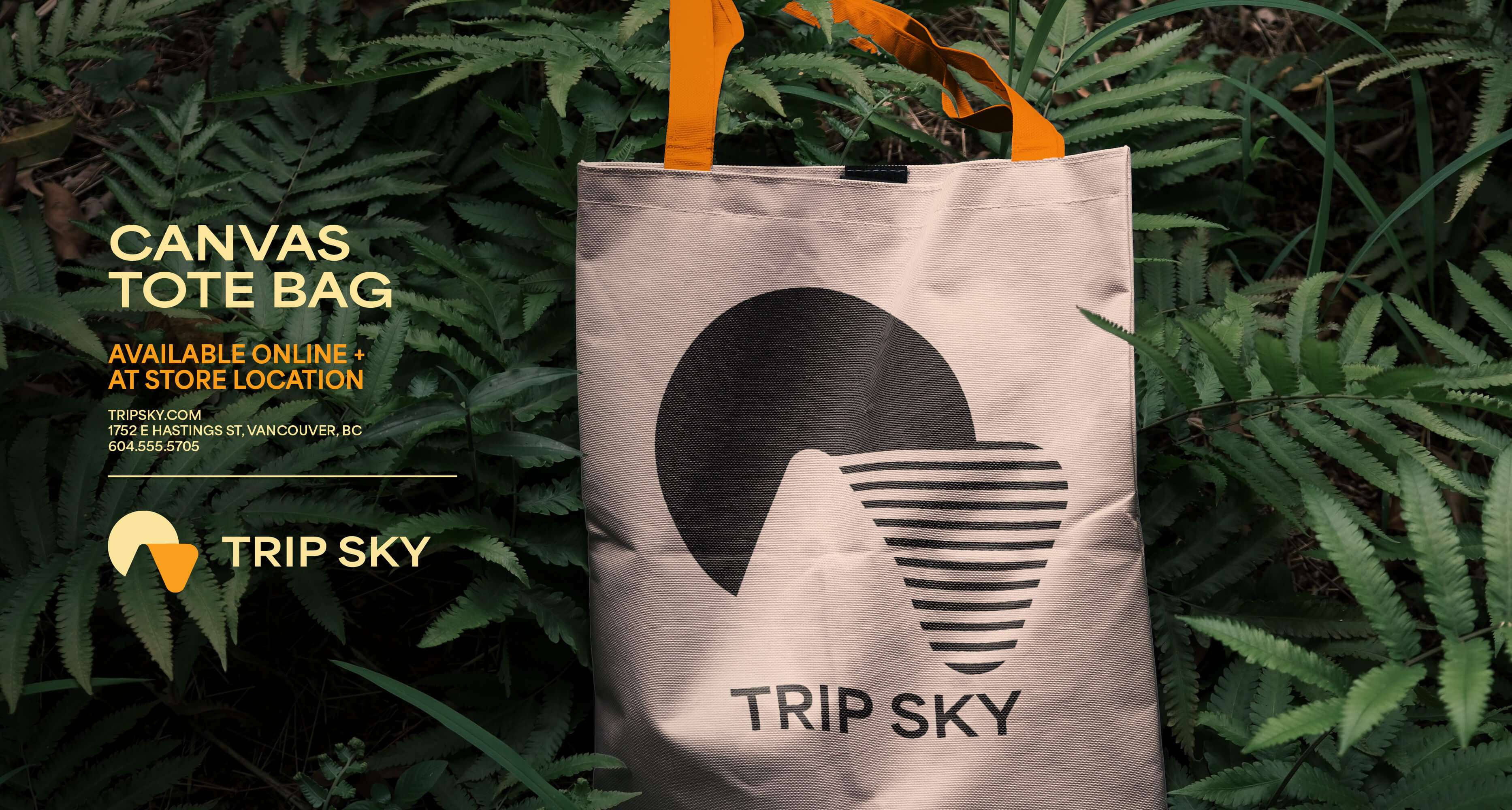
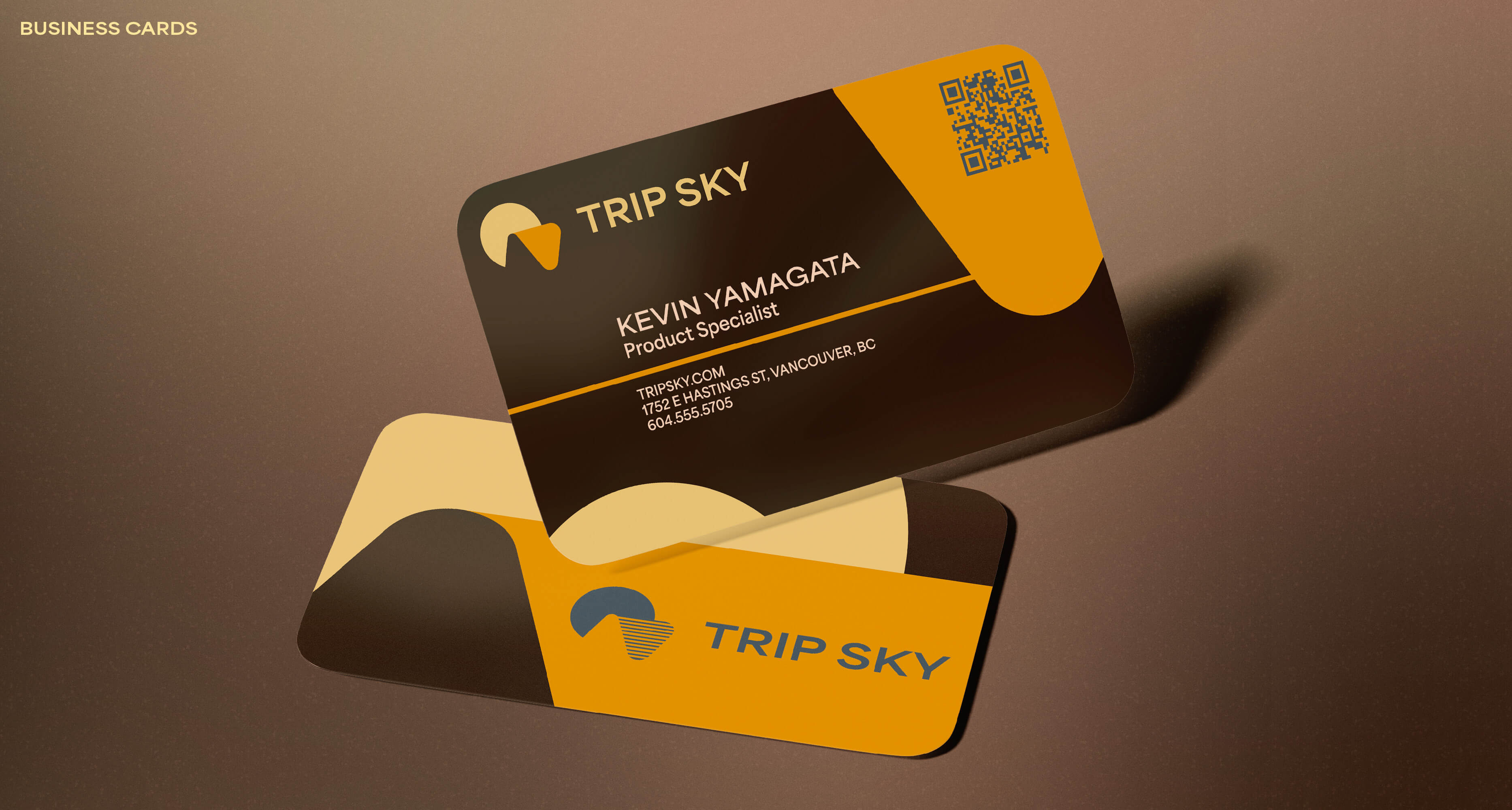
On it’s own, we have the sophisticated logo, which would sit alone on regulation labelling. The circle in the logo represents the sun, and by extension the sky. The arced triangle, and the negative space next to it, referring to the mountainous aspect of British Columbia, as well as the proverbial cannabis trip. To get around having monochromatic branding, Orange and Cream were chosen for the main logo, to feel warm, inviting, and “delicious.”
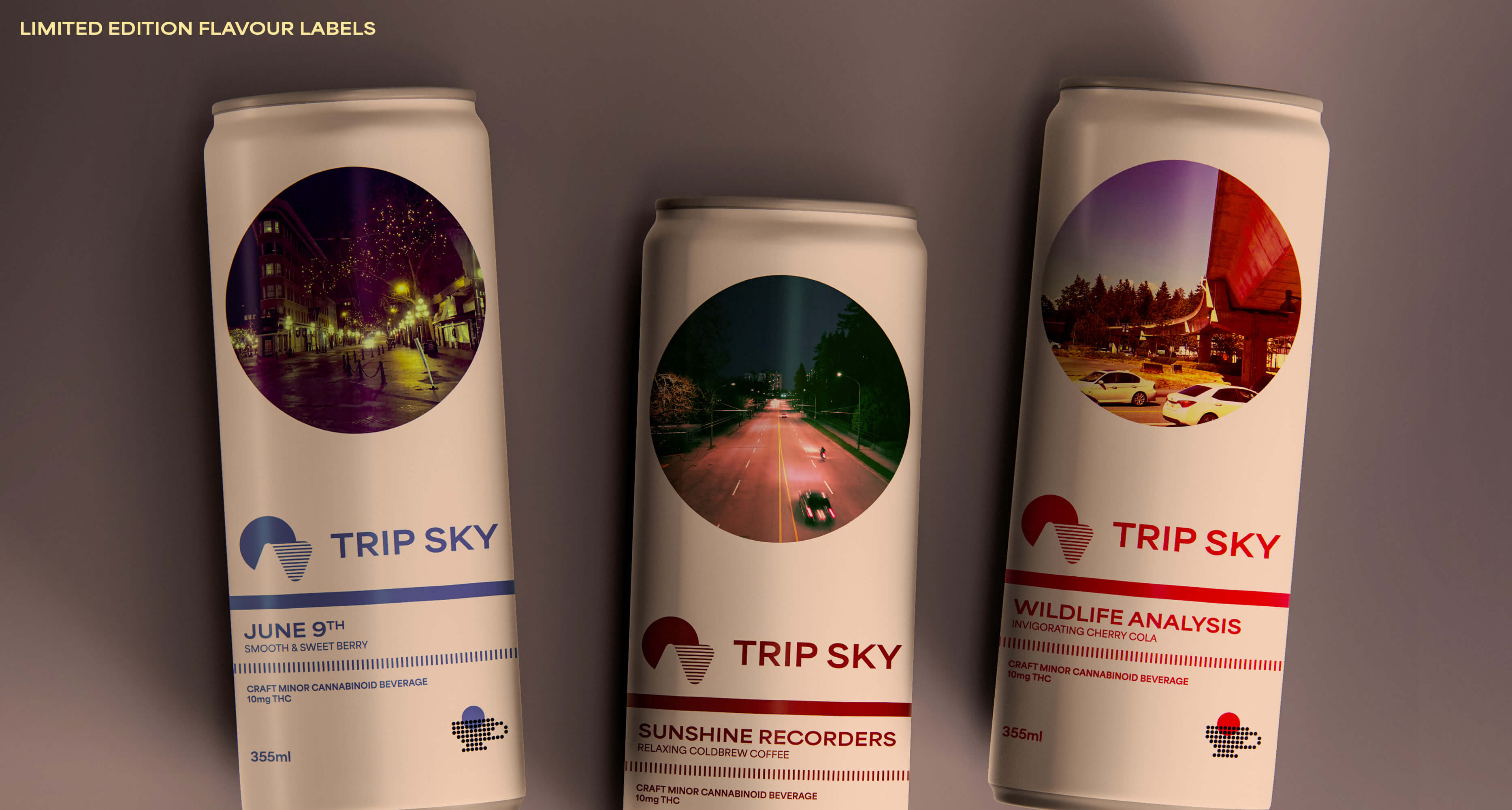
On the product labelling, the colour of the triangle changes to denote a specific product flavour. This is a feature that can be implemented on regulation labelling.
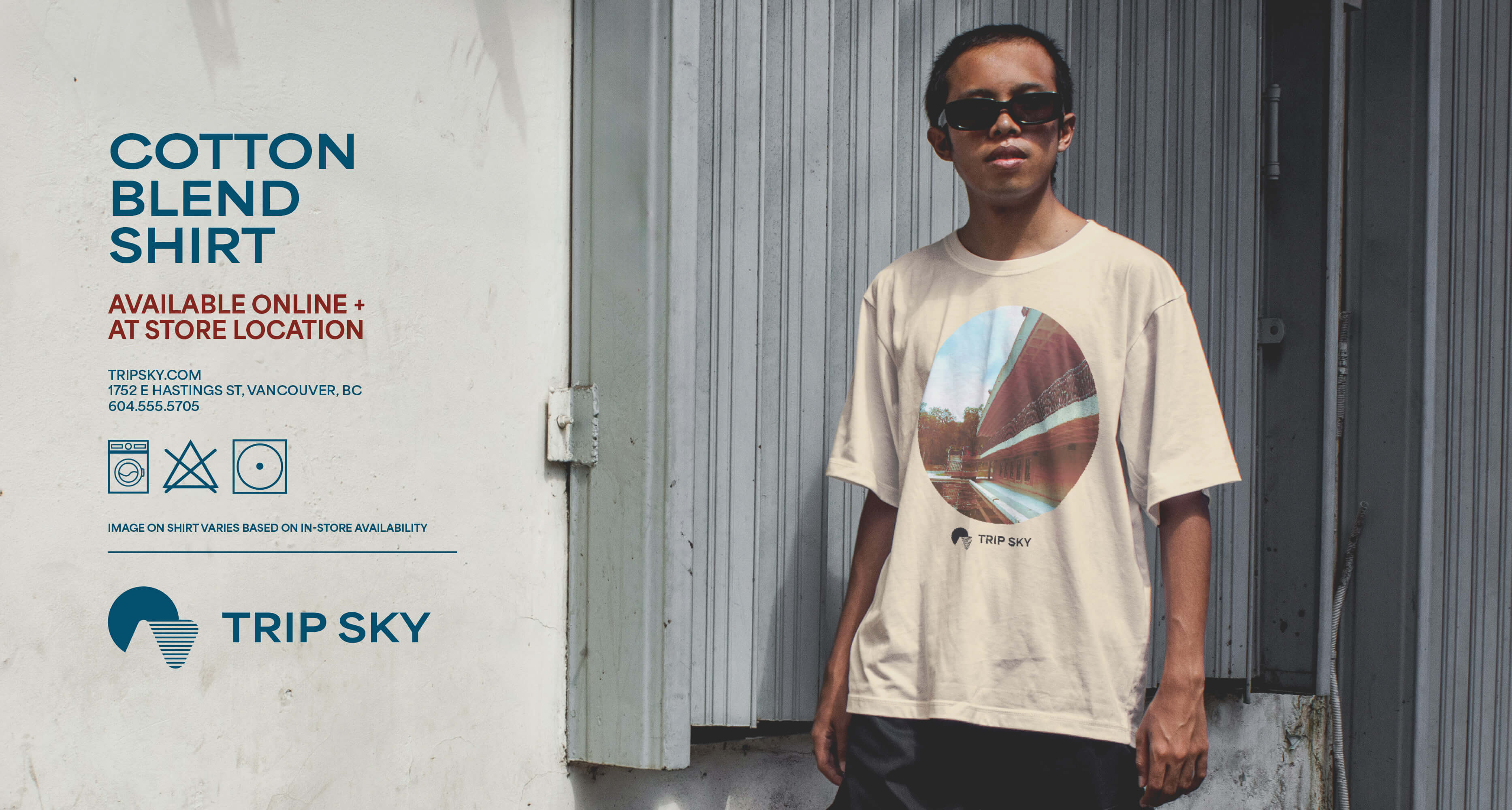
Product labels all feature images of empty, liminal spaces. While these will be removed for retail packaging, they double as an aesthetic that can be associated with the brand. They meet compliance standards for branded product and merchandise. These images were not generated, and are all photos captured by myself, taken in various locations in British Columbia and Manitoba.
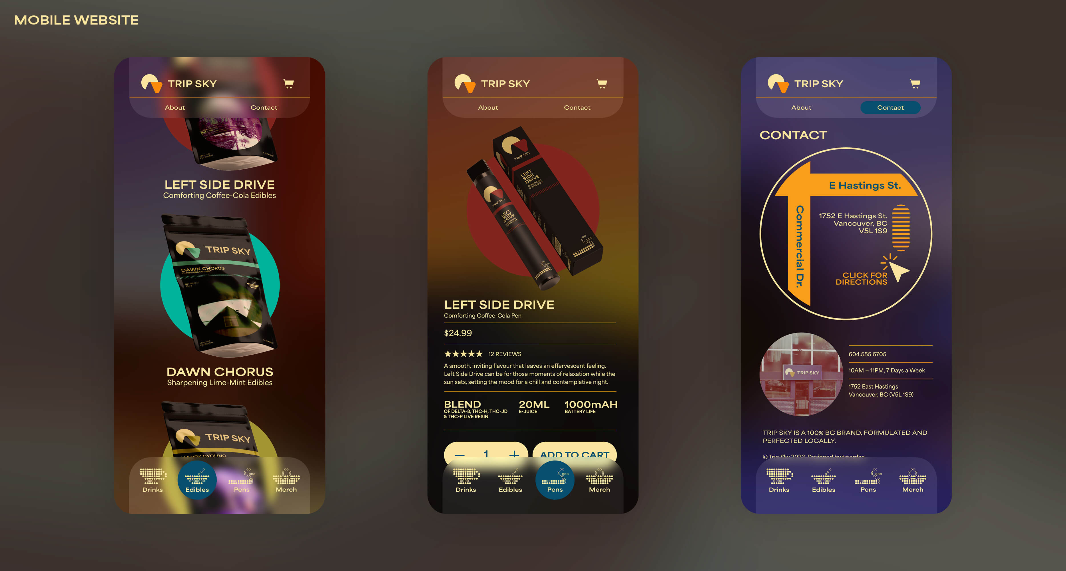
They wanted a unique web experience, something sleek and stylish. As seen in the UI demo, every page would have their own photo as the background image. While this works well on desktop computers, it was difficult to implement on mobile, affecting text legibility. To solve for this, backgrounds on mobile would have a frosted effect applied overtop of them.
The UI demo depicts an online shopping experience, but has been designed to either have stylized product labelling removed when they launch, or have it’s online shopping features removed to become an informational showcase, with directions to their planned physical store.
Overall, Trip Sky aims to be the thinking-person’s choice for cannabis. The pitch here not only captures their desired vibe, but one that can endure in the face of federal regulation.