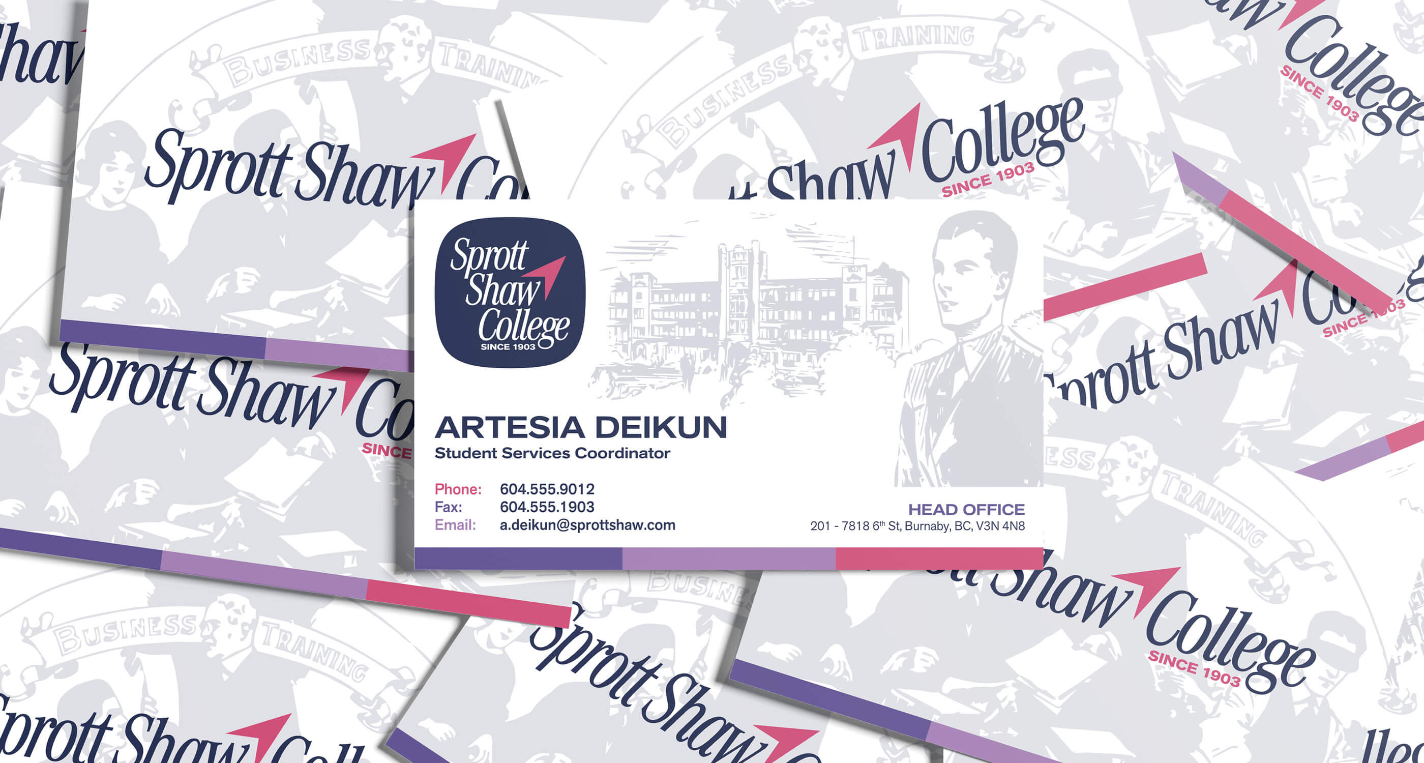
Sprott Shaw College
Private College Institution
Rebrand, Creative Direction + Brand Identity
Sprott Shaw College (SSC) is British Columbia’s oldest private career college institute, providing education to students at our many campuses for over a century.
During my time as the Graphic Designer for Sprott Shaw College, I learned that we did not have any archival material from 1930 — 2000. I felt something had to be done. In mid-2024, I led the initiative to find this material.
After a few months of investigation, going through many sources, I was successful. We not only filled this gap in our history, we discovered lost facts and stories from our early years.
With this new wealth of material, we decided to leverage it to inform a rebrand of the college. Alongside my main responsibilities at Sprott Shaw College, I was in charge of this internal project.
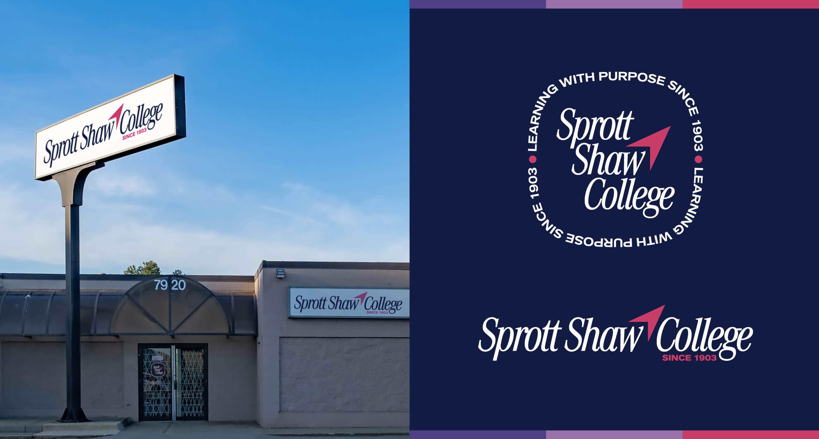
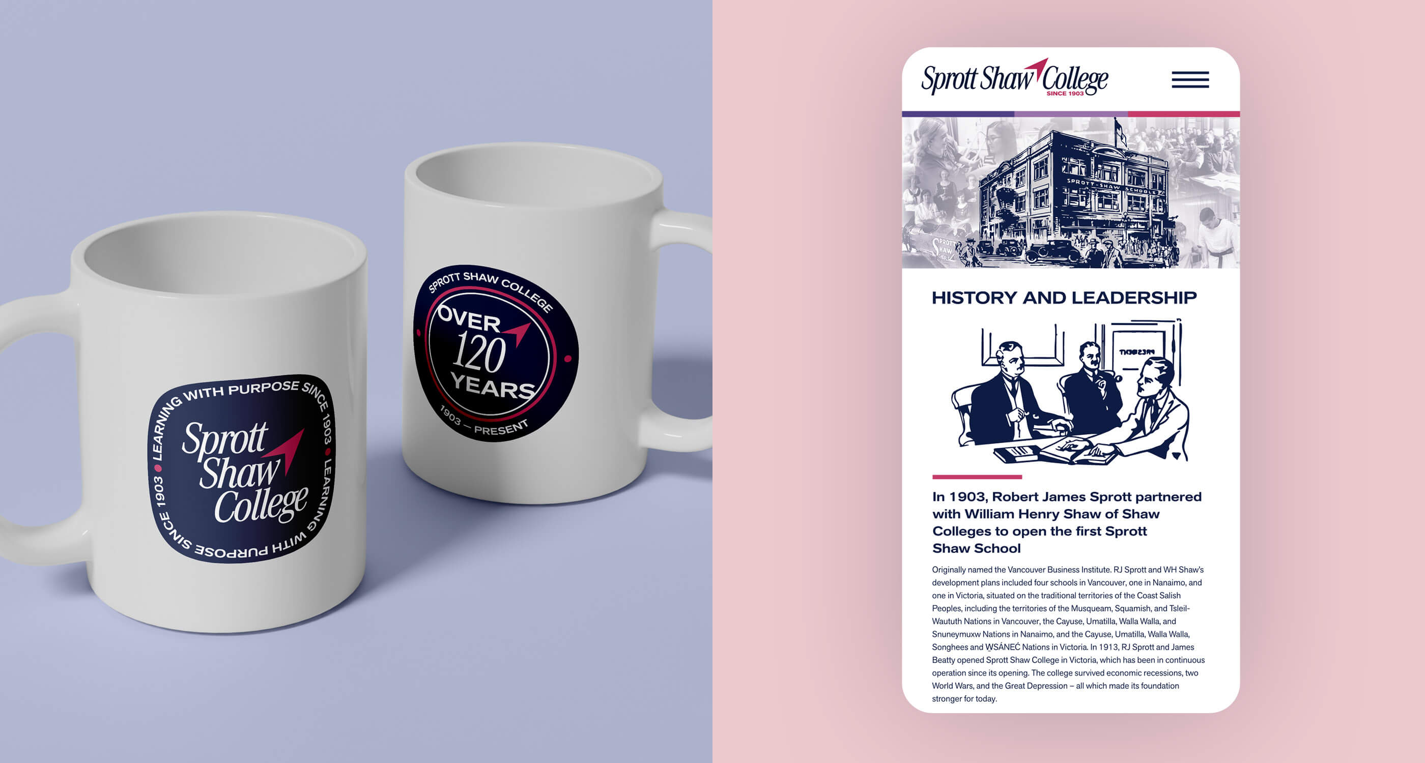
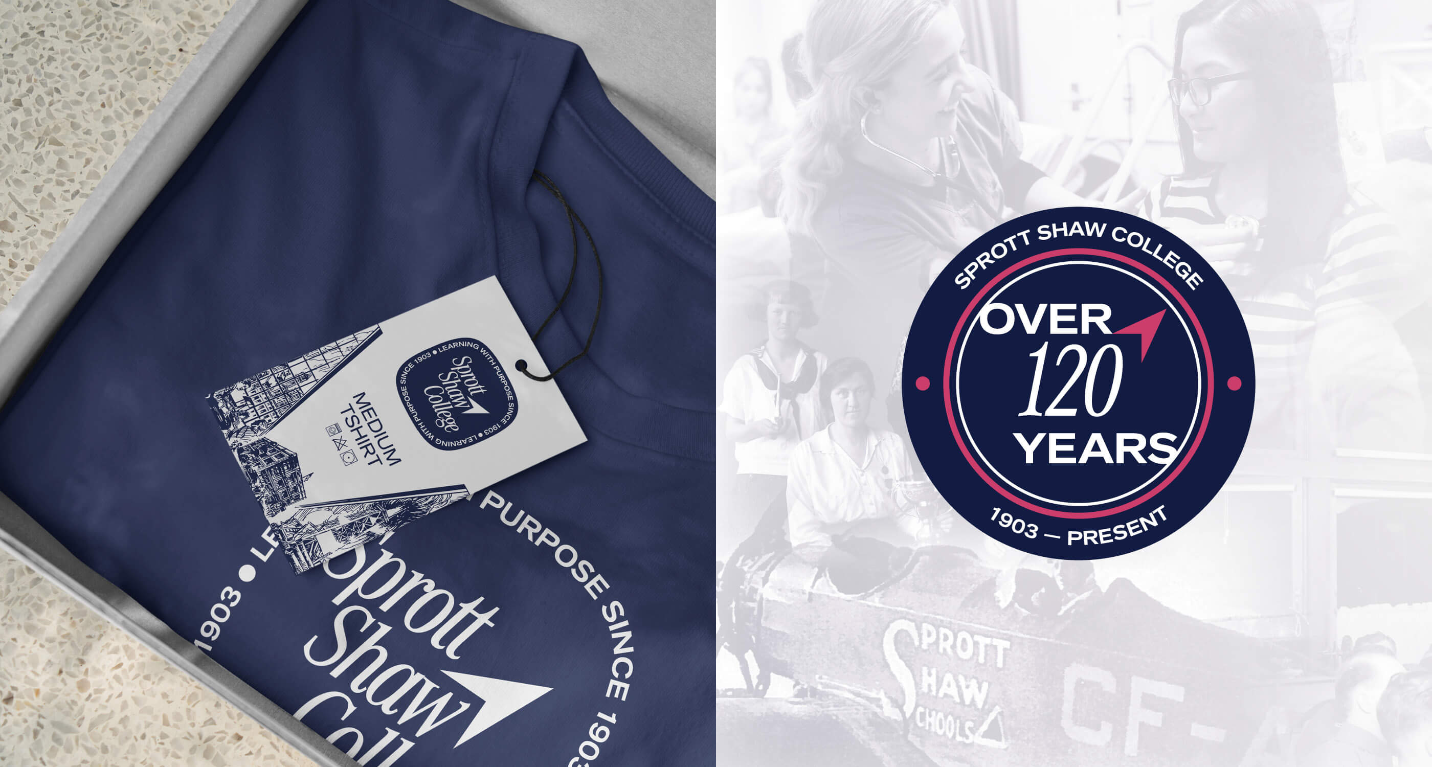
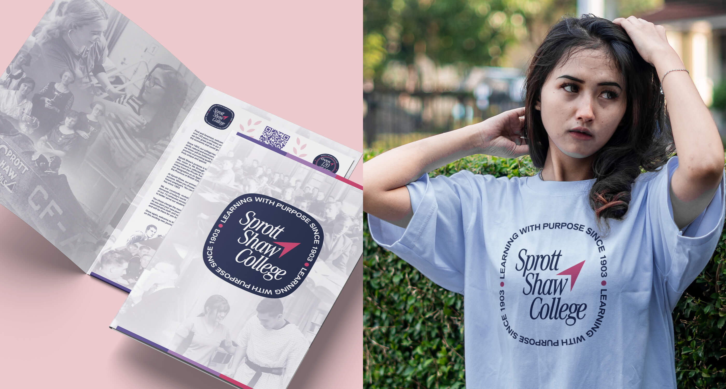
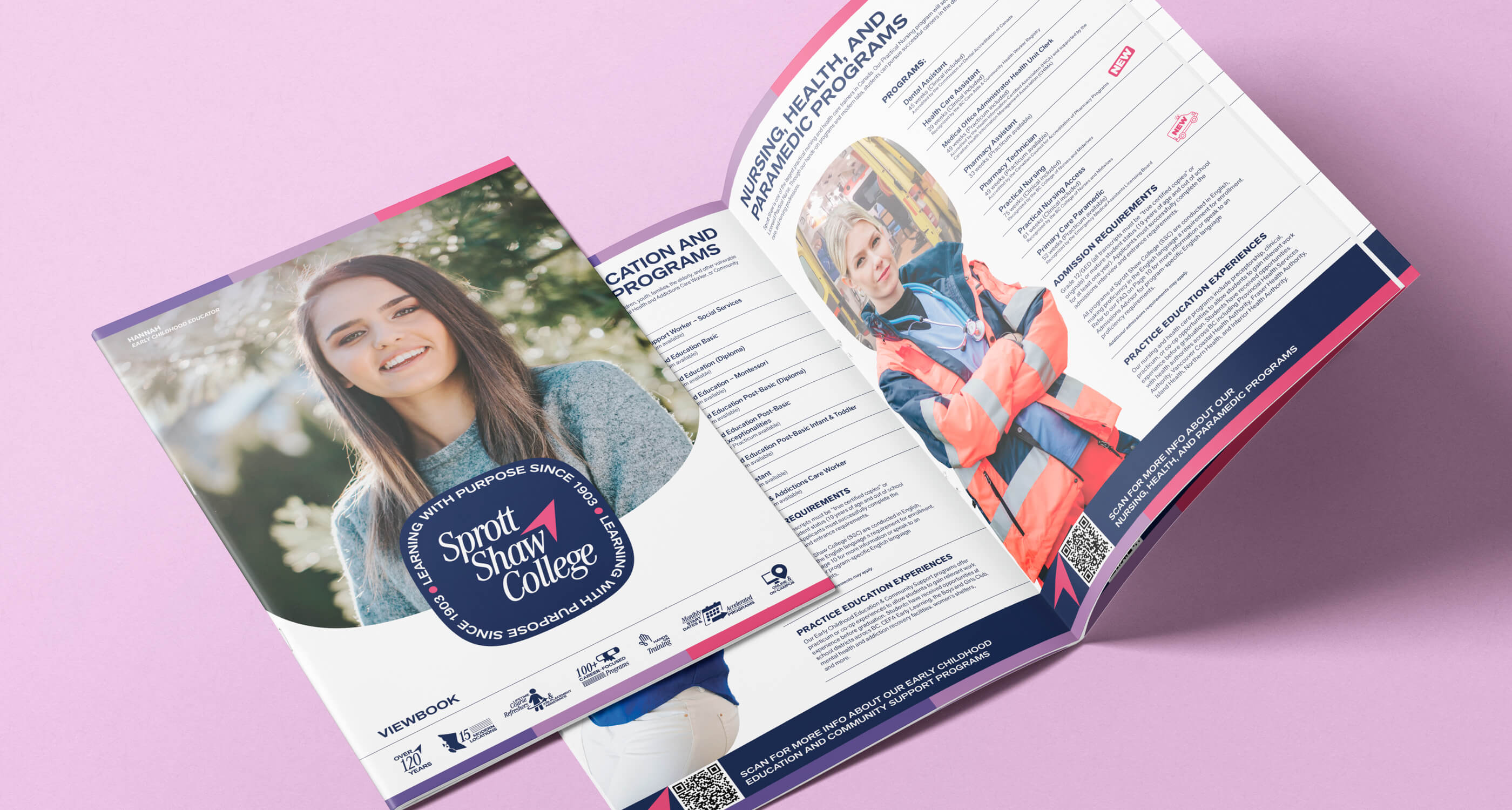
The new logo is a timeless emblem, and to continue symbolizing how we provide direction to students, the compass motif was kept. Two variants of the emblem were made, as well as a stylized wordmark. Our brand colours were updated to provide better contrast for our elements.
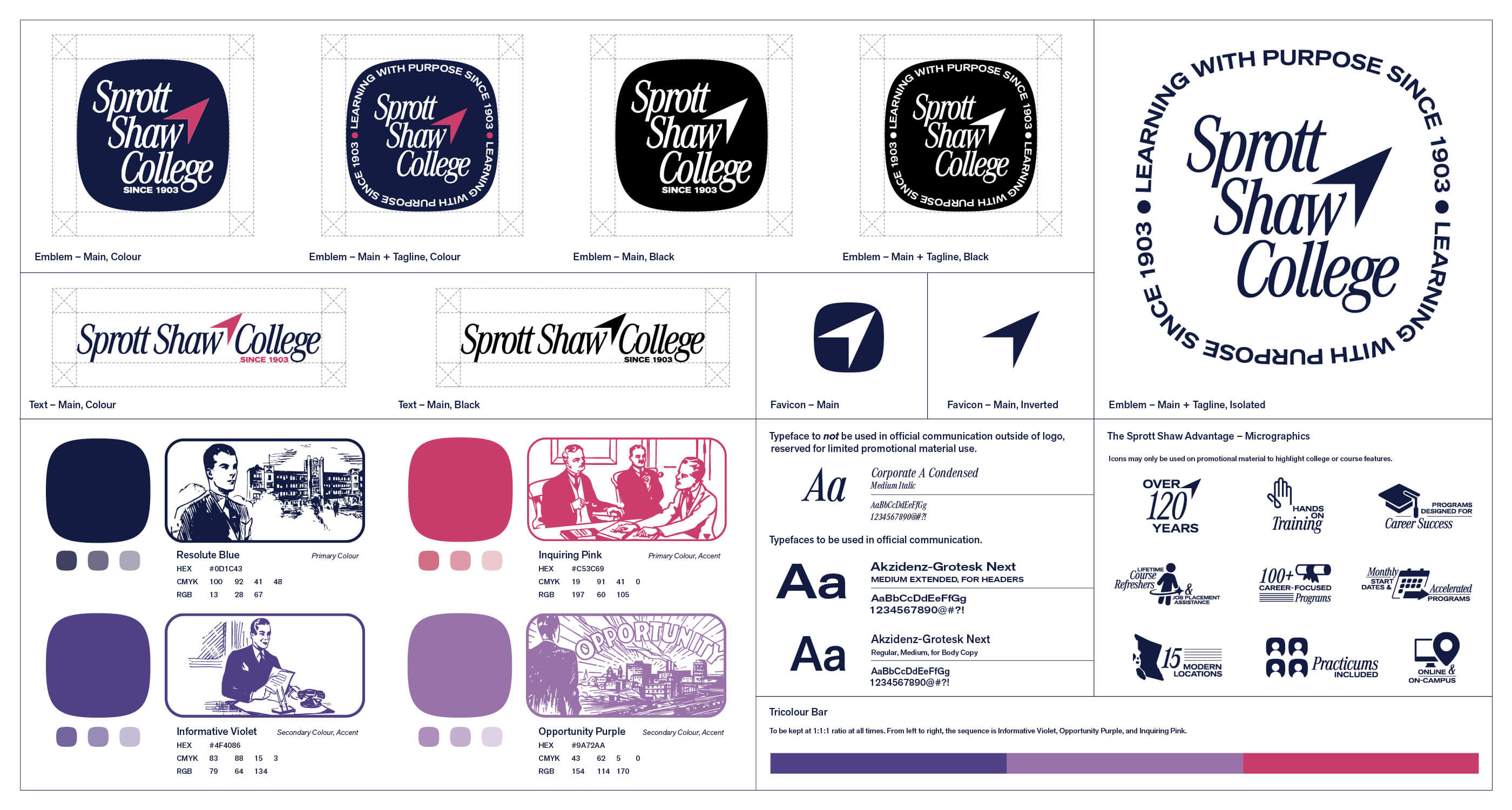
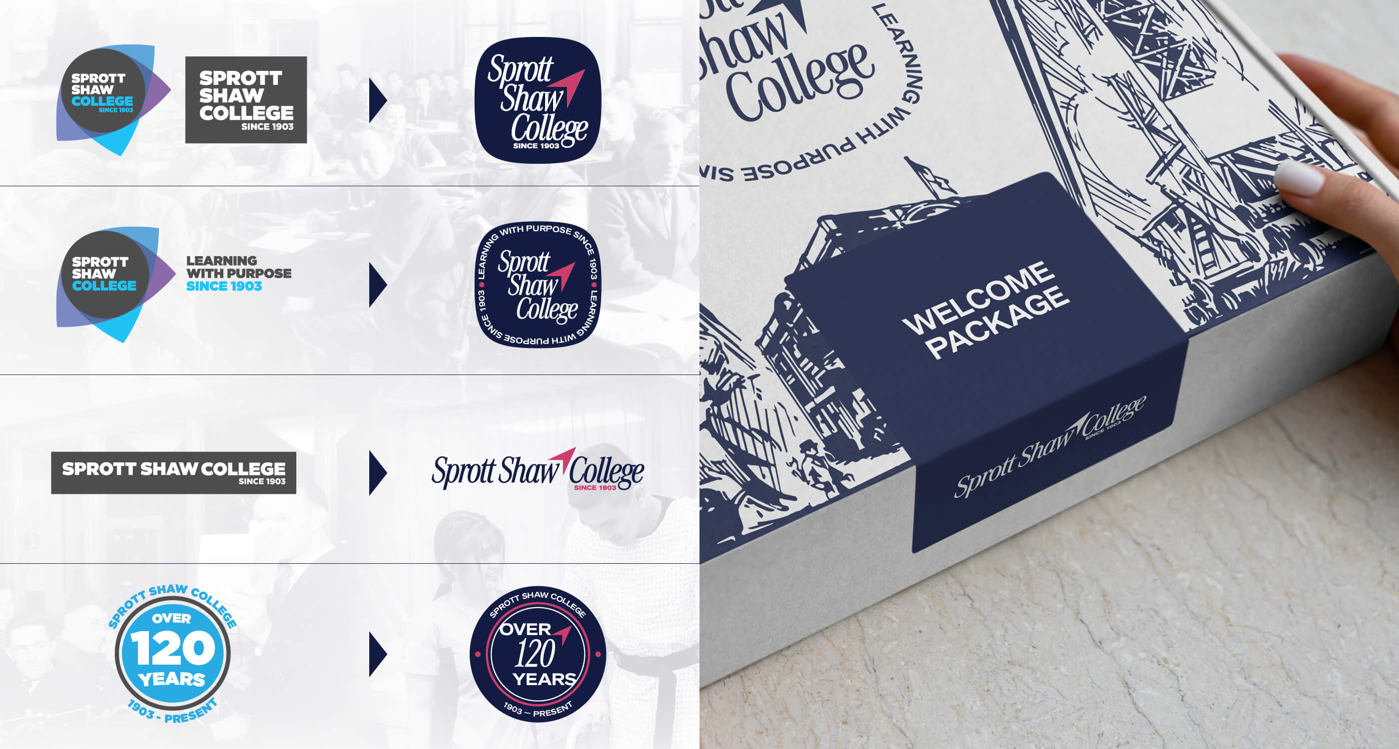
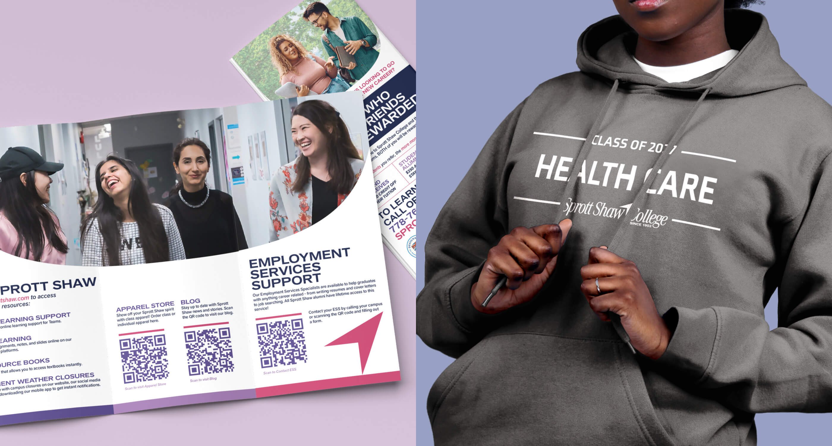
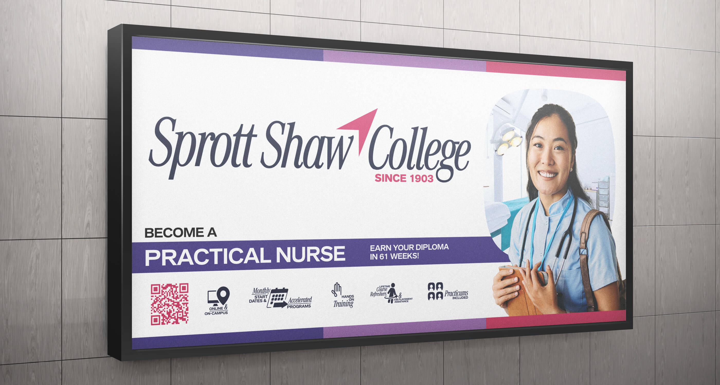
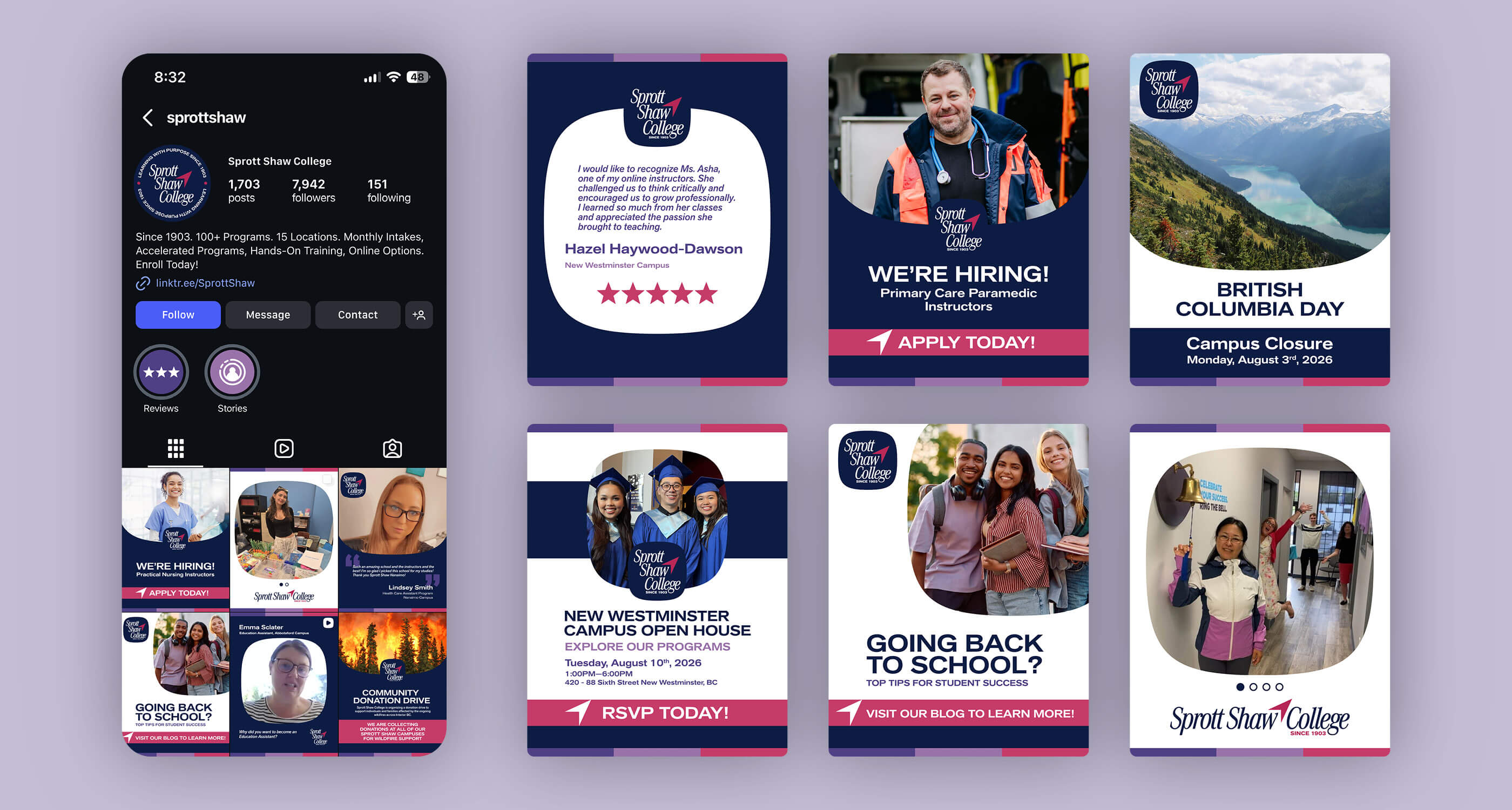
To make our material more visually engaging, nine micrographics were initially made of Sprott Shaw College’s main selling points. It was expected that we would phase out the bullet-point text we were currently using. Over time, we would create more micrographics, to reflect specific features that our courses provide. You can also see here, in a variety of ways, across multiple channels, how we implemented the shape of the new emblem into our new visual system.
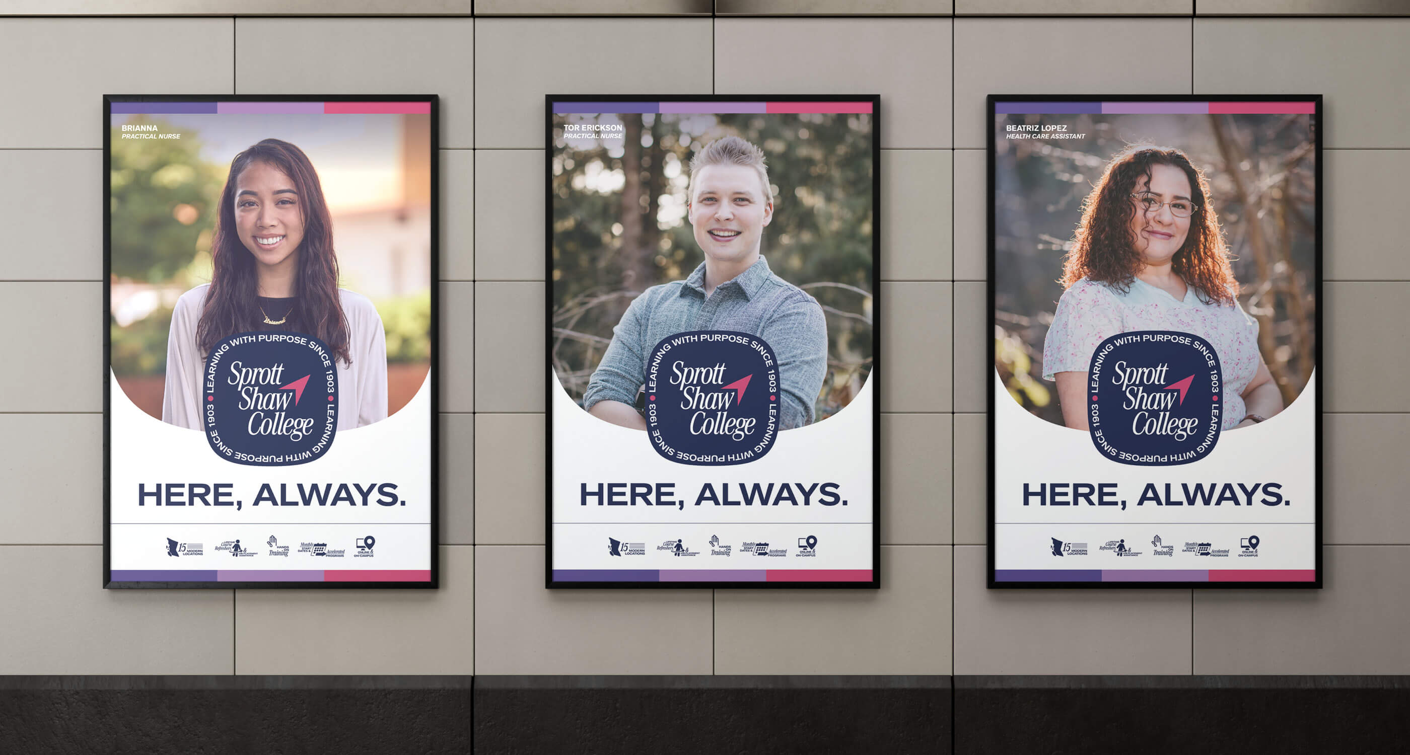
On-location photoshoots for advertising our courses are time-consuming, and proved difficult to coordinate. Here, I provide examples of people posing against a background in the shape of our emblem. This was to propose an alternative method to our conventional photoshoots and eliminate our use of stock photography: taking photos of people in job-specific outfits against a green screen, and then taking photos of the appropriate environments separately.
With a large cache of individual backgrounds and models at our disposal, we would have great control of our proprietary visual material to work with, and provide an opportunity for creative visual solutions for our advertising.
A redesign of the website was included in the pitch. The main focus was to remove redundancies that exist in the current website, streamline the UI, and improve the formatting of the information we provide for a stronger reading experience.